Designing with Madre Perola Quartzite: 3 Stand-out Features From Hello Pearl’s Kitchen Redesign
Sweet Knoll Colonial
Design: Hello Pearl Interiors
Stone: Adamo Stone Design
Paint: Felino Salas
Styling: Jeana Kim
Art: Coco the Inspirationist
Photography: Jessie Wyman
Hello Pearl Interiors has been infusing vibrant style and color throughout New England for years. At the helm of design is Alysha St. Germain-Heidke, who says that sometimes, all it takes is a new set of eyes with a fresh perspective to uncover a home’s potential.
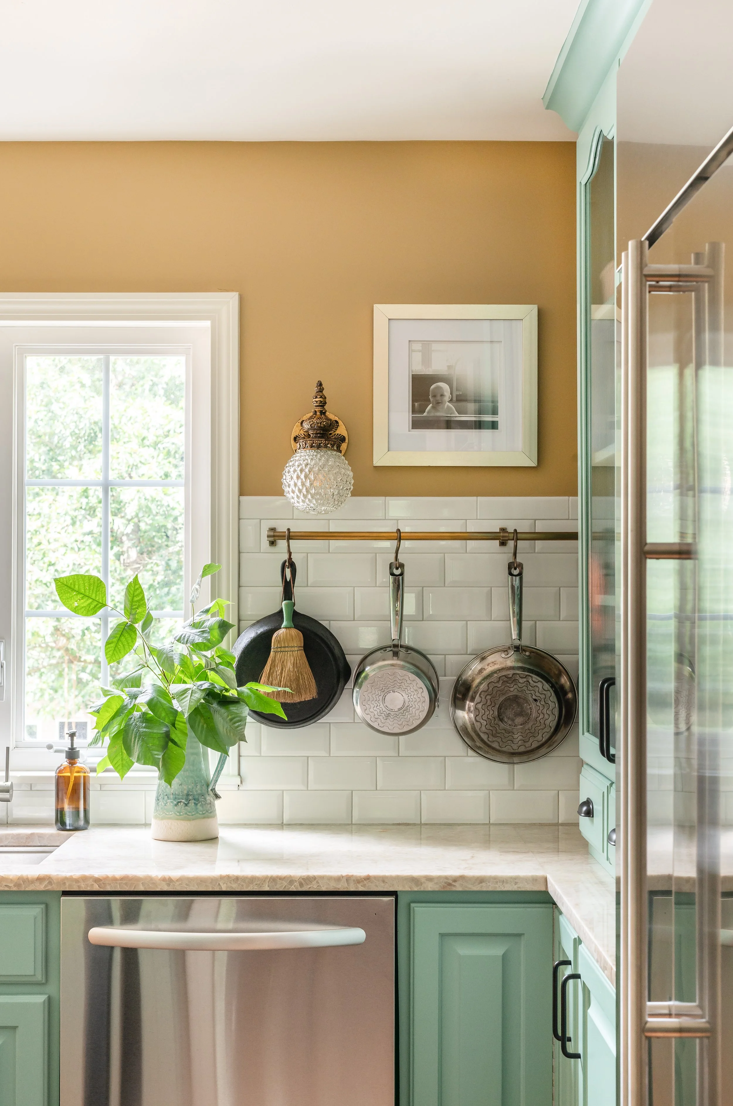
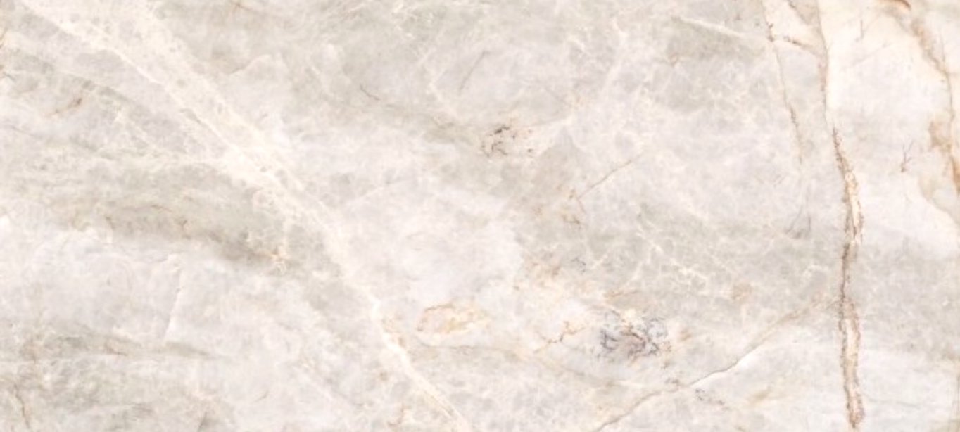
Old details were reframed into beloved quirks in this kitchen redesign of the “Sweet Knoll Colonial” by Hello Pearl Interiors. Instead of demolishing the kitchen, Alysha preserved the heritage character of the home’s existing cabinets while incorporating new elements that brought the space to life. She introduced new layers of texture and color tones to the brightest side of this kitchen through a polished Madre Perola quartzite. This added element was custom fabricated by Adamo Stone Design for the L-shaped accent counter.
Although commonly sourced for contemporary spaces awash in “greige” hues, the Madre Perola quartzite in this design changes its course and takes on an active role in this colorful space. In true Hello Pearl fashion, the Sweet Knoll kitchen design began with creating a harmonious color palette comprised of various shades of green that called forward the terracotta undertones of the countertop stone. The creative use of this exotic stone adds more than a touch of elegance— here’s our pick of the top three stand-out features from Hello Pearl’s kitchen redesign.
1.) Use of Color
”A carefully chosen interior color palette is a foundational element of all our design schemes,” Alysha says.
By determining their client’s color and design preferences, Hello Pearl can tailor their design schemes to match. In this case, Alysha combined their preference for natural materials and unique design elements with the nostalgia for a mid-century-inspired color palette. In this way, creating a design aligned with the client’s original vision was easy.
2.) Kitchen Flow
The most fundamental feature of a kitchen is its flow. As visual creatures, we constantly seek confirmation from our environment to support our actions. Every one of Hello Pearl’s projects prioritizes flow which allows the space’s inhabitants to access their rooms in an effortless way.
The placement of a kitchen peninsula had blocked the previous design movement through the kitchen. By establishing the client’s individual needs and intended use of the space, Hello Pearl created a layout that supports the family’s active lifestyle.
From the L-shape counters to the free-standing kitchen island, the compositional flow of this kitchen leads us through the design: where to look first, where to pause, and where to look next, thus creating a feeling of ease that permeates the entire space.
3.) Mixed Elements
Rather than act in accord with one overarching style, this kitchen celebrates a blend of several periods and eclectic elements. As you step back, each of the unique fixtures, surfaces, and details feel layered, as if they were one cohesive element.
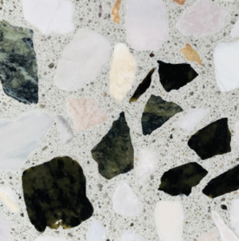
Although rarely paired together, the natural quartzite of the exterior countertop and the modern terrazzo stone of the kitchen island both engage the original color palette. The foundational color palette creates a confidence that unifies the various countertop surfaces regardless of the variations in their movements or styles.
Hello Pearl also found a way to integrate a variety of metallic accents by matching metals across categories. This array creates a curated look that proves attention to detail throughout. Although metal appliances and fixtures from various periods live alongside one another, the color palette ties the metal collections together effortlessly.
To learn more about Hello Pearl Interiors and to view other exceptional homes designed by Alysha, visit hellopearlinteriors.com and follow @hellopearlinteriors on Instagram.


